Showing posts with label Vogue. Show all posts

Monday, May 14, 2012

Style Crush: Ulyana Sergeenko

The April issue of Vogue UK has a fabulous story on fashion taste makers - you know, the non-celebrity types who fashion bloggers are enamoured with, snapping away at for street style blogs - and amongst the many fabulous ladies featured (hooray for colour) is Russian designer Ulyana Sergeenko. Her style is a little bit 1940s, a little bit House of Romanov, and I love it.
Her eponymous label is gorgeous too. All sweeping skirts, cinched waists and luxurious fabrics. Here are some examples from her latest look book.


And Ulyana on the street looking pretty as a peach. She really is the best advertisement for her own clothes.

Thursday, April 5, 2012

A little blog holiday ...

It has been four years since I started my little blog Digs Frocks and Books and in that time I've never gone more than about a fortnight without posting. Along the way I've learned a whole lot about fashion history - designers, fabrics, styles, photographers, models - and I've connected with fashion lovers (and book lovers) all over the world.
In the interests, however, of pursuing other projects and finding more time (life is so full these days: work, freelance work, reading, friends, husband, family, exercise, house work [yuk!] my lonely unfinished novel) I've decided to take a break from the blog for a month. This is a trial separation only and all the content will remain online. After the break I will most likely be back but if I decide to make the break more permanent it will be because my creative energies will be busy elsewhere. Truly it will be the blogging community I'll miss the most.
Meanwhile happy (Easter) holidays. I'm heading up the coast to spend the Easter weekend with my parents. Vogue tells me I should be wearing belted cardigans over long dresses for autumn and it seems Claudette Colbert agrees. Come to think of it her look from It Happened One Night has never really gone out of style, right?

Thursday, March 1, 2012

Smashing, positively dashing ...

Famed photographer, diarist and costumier Cecil Beaton had already been lauded for his costumes for the London and New York theatrical productions of My Fair Lady (starring Julie Andrews) when he was commissioned to create costumes for the film version. From the December 1963 issue of US Vogue comes this gorgeous preview of those very costumes, photographed by Cecil himself and starring the new Eliza Doolittle, fashion plate Audrey Hepburn. Says Vogue ...

the delicious dilemma we have here is simply this: When Audrey Hepburn, on the brink of the plummiest part of the decade, cast those great enrapturing eyes on the clothes Cecil Beaton designed for everyone else in the cast, she suddenly knew that 'Liza is one of those heroines with almost Nothing to Wear ... Shaw invented her long before he wrote Pygmalion, as a "rapscalliony flower girl in an apron and three orange and red ostrich feathers." Tatters and violets, that's what Eliza starts with. But Audrey Hepburn, before taking to those real garn rags, had one glorious whirl with the gilded-lily dazzle clothes designed for the swells and chiquerinos of the Acscot Chorus and Convent Garden.

The final result, of course, was an Oscar winning bounty of timeless beauty. And thankfully for us Audrey so loved that frilled dress with the organdie boa in the final image that Cecil created one for Eliza in mauve that she wore in the scene in Mrs Higgins' garden. Set in 1914, My Fair Lady covers the same period (and merges the same crowds) as Downton Abbey.

Don't you just love the shades of black, white and grey in the famous Ascot scene from the film? And the hats, oh my, the hats. Vogue says that with his hats Cecil Beaton 'blows life into the statue.'


Saturday, January 21, 2012

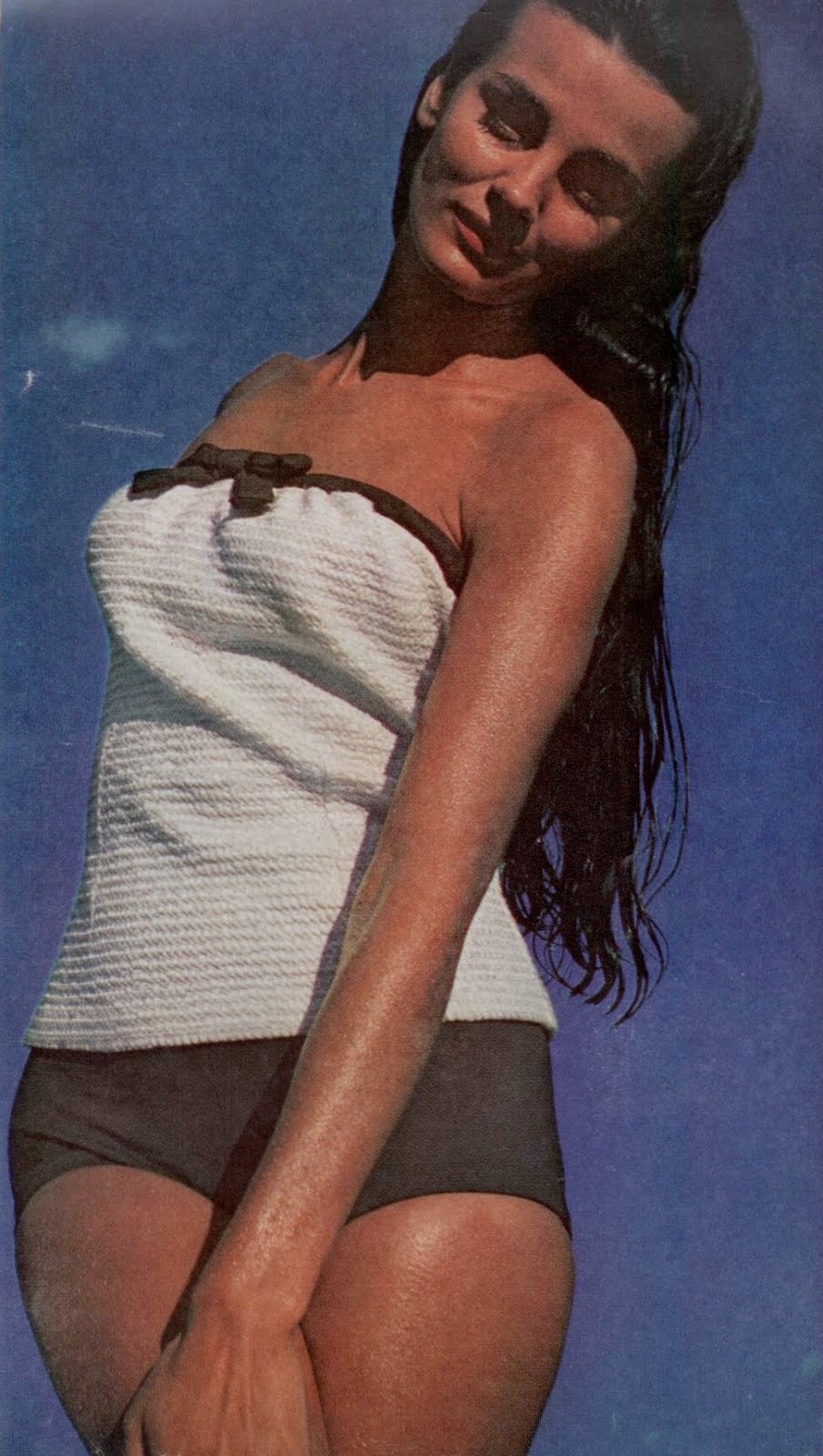
Swimwear, 1963

These sultry images are from a swimwear shoot for the December 1963 issue of US Vogue photographed by well-known NY based music photographer Art Kane. The theme is the bandeau swimsuit, very much back in vogue again now, although perhaps it never really went away. After all there's nothing quite like a strapless swimsuit to create a nice even tan.
Starting this minute down south, coming north with a splash this summer: the bandeau bathing suit, slashed straight across the top, showing marvellous shoulders, cut shifty or bare through the middle.
The bikini featured in the last photograph (bright green according to Vogue) looks very similar to my own bright pink bikini, care of Zimmermann. Here is a pic of me wearing it on my most recent trip to Mission Beach in Far North QLD two weeks ago. The husband and I spent a lot of time exploring the area and we found a few gorgeous swimming holes at the foot of the mountains with the clearest freshwater imaginable. The other photo is of me wearing my favourite new vintage shorts care of Grandma Takes a Trip. The top is from The Vintage Drawer, the sunglasses are a second-hand market find and the handbag is Marc by Marc Jacobs.

Monday, January 2, 2012

Norman Parkinson in India

The January issue of British Vogue includes a feature that trawls through the Vogue archives for images from exotic locales. 'The fashionable life, lived at home and abroad, was vital to Vogue's early success.' There's Morocco in the 1920s, Hawaii in the 1930s, Kenya in the 1960s and Jerry Hall in the USSR while the cold war was still raging. My favourite images though are the ones taken by Norman Parkinson in 1956. The model is Barbara Mullens, the clothes are elegance manifest and the locations would give anyone itchy feet. I LOVE that yellow Dior gown.


Sunday, December 4, 2011

Wishing Away the Rain

I've been neglecting the blog while I've been travelling the countryside for work and now my thoughts - especially in the face of unseasonal cold weather and bucketing rain - are turning to holidays. Next weekend is a girls only mini break on the Gold Coast and next month is a week in my favourite spot in Far North QLD. I'll be taking my own gingham bikini with the tie-front top, but I won't be looking anything like Kate Moss.
These pics are from a cover shoot from a couple of years ago for Paris Vogue. The photographer was Mario Sorrenti.


Wednesday, November 23, 2011

The 60s Face

Some further scans from the March 1965 edition of US Vogue; these images (from photographer Bert Stern) illustrate a beauty story contrasting 'European' make-up (think Italian mid century films) and the 'new American-English' make-up (soft, illuminated transparency). There is no doubt though that, being the sixties, the eyes had it for both of these looks and that colour was the real trend on display here. Silver lashes! Luscious falsies! And blue eyeshadow (that freaks some people out, but which I've loved for years and years. My eyes are about the same colour as the model on the left of the top picture, and there is something about the contrast between baby blue and deep brown that appeals).

Anyway, these photos got me thinking about my favourite beauty trends across the decades. I've always been partial to the slick of black eyeliner so popular in the 1950s; the shiny, voluminous and effortless hair of the early supers; the vibrant, matte pink and red lips of the 40s and 50s; the strong full eyebrows of the late 70s and early 80s; the over sized lashes of the 1960s (but only on top please ... I have a paranoid fear of gluey mascara on the lower lashes) and, finally, the tanned skin from the real life sun of the 1970s (my bad, I know, but fake tan just doesn't cut it for me. I love alabaster skin too but I'm not someone who can wear it well).

What is your favourite beauty decade?

Sunday, November 6, 2011

Tzaim Luksus - Art Nouveau

In the March 1966 issue of US Vogue I came across this wonderfully colourful editorial entitled Art Nouveau - flowering again in America.

The story claims that in 1996 Art Nouveau was undergoing a spirited renaissance in contemporary design: furniture, decor and fashion. And one of the most exciting torchbearers for this renaissance was American painter turned fabric designer Tzaim Luksus. Luksus had received a COTY fashion award in 1965 for his startling prints and in the same year that this editorial would appear, he would show his own dress collection. He would keep showing into the mid 1970s, as a fan of the tent and kite silhouettes.

In this case the fabrics are Luksus' but the designs are courtesy of Geoffrey Beene and Pauline Trigere. I love the originality and modernity on display here, the models back lit beautifully by stained glass. The last dress is a particular fave.

The photographer was Gordon Parks and if you can steal a glance away from the dresses to the hairstyles, you'll discover they are completely wild? God knows how the models posed with such heavy hair pieces. So 1960s.

And doesn't Verushka look stunning in the last two pics?

Wednesday, November 2, 2011

Early Jean P


From the same 1948 issue of US Vogue as those photos of a 16-year-old Elizabeth I posted comes these two images of the glorious 50s top model Jean Patchett. Jean would have been only 21 or 22 when these photos were taken, and in the first year of her modelling career, which lasted until 1963. She signed with an agency in early 1948 and by the end of the year she was already a cover-girl, gracing the pages of Vogue.

The editorial that the photographs come from is called 'Fashions For A Man's Eye' and has models posing in some of Vogue's favourite recent frocks for the benefit of a panel of men who give their thoughts. It's all quite amusing really and is a concept still used in magazines today.

As the point of this issue is 'Will a man like them?' we went to four acidulous young columnists, who were part of the male rebellion against the new-born new look a year and a half ago; showed them the dresses, invited them to say exactly what they wanted to about them, pro or con.

You might like to know that the judge for Jean's first dress said men embarrass easily. This dress isn't embarrassing.
And for the second dress the male critic said I like halter-tops. They show off a good back.

When it comes to men, it seems not too much has changed. All the men declared that they detested ballet flats! (Lucky we don't care what they think).

The advertisements in this issue are just as exciting to pore over as the fashion editorials. I think my favourite frock is the gorgeous Patullo - Jo Copeland for the opening of the Opera ... for a brilliant ball. Patullo - Copeland was a shared ready-to-wear label designed by Jospehine Copeland, based in New York, that existed from the 20s through to the 60s. You can read more about her over at the Vintage Fashion Guild.

Interestingly her daughter, the novelist Lois Gould, wrote a memoir in the 1990s about her mother, from a child's perspective. Called Mommy Dressing I'm sure it would provide a fascinating insight into the world of early American high fashion.